Case Study: Art Van Checkout
Frequent drop-off rates and a complicated checkout experience prompted an investigation a full redesign. Throughout the redesign, the product team kept these key things in mind:
- What are some of the pain-points customers are running into while in the checkout journey (feedback taken from Voice of the Customer)?
- How can we solution for these pain-points? What are we hypothesising will happen if we design solutions for these issues?
- Scrap what we know about Checkout as it exists today, and design the ideal customer experience journey from the beginning of Checkout to Confirmation Of Purchase.
Final Wireframe
Checkout as Guest vs. Sign Into an Account
Conventionally, guest checkout allows the customer to follow through the checkout process and create an account after reaching the confirmation page.
Rather than scare away the customer and making them think Art Van wants to capture their information to spam them, gathering the customer email and phone number should be relocated to a more thoughtful location within the checkout. Instead, when a customer interacts with the Checkout CTA from within the Cart, prompt a drawer that asks customers clearly to either Continue As Guest or Sign In & Checkout.


Multi-page experience vs. Single Page
The Art Van Checkout contains 3 pages, which in theory sounds like checking out won't take much time. However, each page requires customer to input information into many fields.
- Delivery: 11 input fields
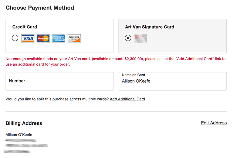
- Billing/Credit Card: 15 input fields (assuming billing address is different from delivery address)
- Billing/Art Van Signature Card: 13 input fields (assuming billing address is different from delivery address)
- Review & Place Order: 0 input fields
Overall: across Art Van Checkout, a customer will be inputting information into 25 different fields.


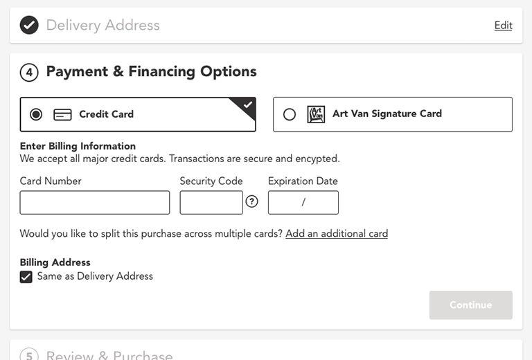
Creating a single page experience where fields collapse after a customer has finished with each section gives the customer a feeling of completion and making progress.
Chunking sections of the checkout also allows customers to focus on one task at a time, rather than being distracted by something that could pull them out of the funnel.
Delivery and In-Store Pickup
From the cart, if a customer makes the choice to have their items delivered, then this choice would persist to checkout. Simplifying how a customer makes changes to their delivery date and shipping options helps reduce customer confusion.


Delivery Address
In the spirit of information persisting from the cart, if a customer has input their ZIP code to estimate delivery options this would follow through to the step regarding Delivery Address.
Because we know the customers ZIP code, we can auto fill the City and State to create a faster and more seamless experience. This also helps reduce the number of fields needing customer input from 9 to 4.


Payment/Billing
Ideally, all payment done online should feel like it's being handled securely by the company a customer is trusting with their card information. Reinforcing this through certain language and utilizing basic security functionality will help customers feel their information is safe and will continue through the funnel.


Utilizing a "Same as Shipping Address" field helps reduces the amount of repetitive customer information needed to follow through to Review.
Review

Expected Results
At it's current state, only 0.1% of customers are getting through the entire checkout funnel. By implementing these updates this number could potentially increase to 0.89%, the average percent in the furniture eCommerce market, leading to an increase in conversion and an overall increase in revenue.
Programs used: Sketch App