Case Study: Art Van Cart
Frequent drop-off rates within the Cart prompted an investigation as to why this could be occurring, and the result of this investigation led a full redesign. Throughout the redesign, the product team kept these key things in mind:
- What are some of the pain-points customers are running into while in the Cart (feedback taken from Voice of the Customer)?
- How can we solution for these pain-points? What are we hypothesising will happen if we design solutions for these issues?
- Scrap what we know about Cart as it exists today, and design for the ideal customer journey.
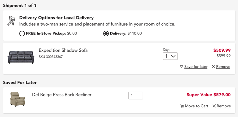
Issue #1: Customers are unable to see shipping costs and Delivery Options at the cart level.
As it exists today, delivery options are tied to product tiles from within the cart. Meaning customers are able to see what type of delivery each product qualifies for, however they’re unable to make any type of delivery choice from within the cart.
To complicate things further, products that are delivered by Art Van are placed into one ship group; products that are shipped for free from vendors are placed into a separate ship group. This is not accessible to the customer at the cart level, which leads to confusion and frustration.

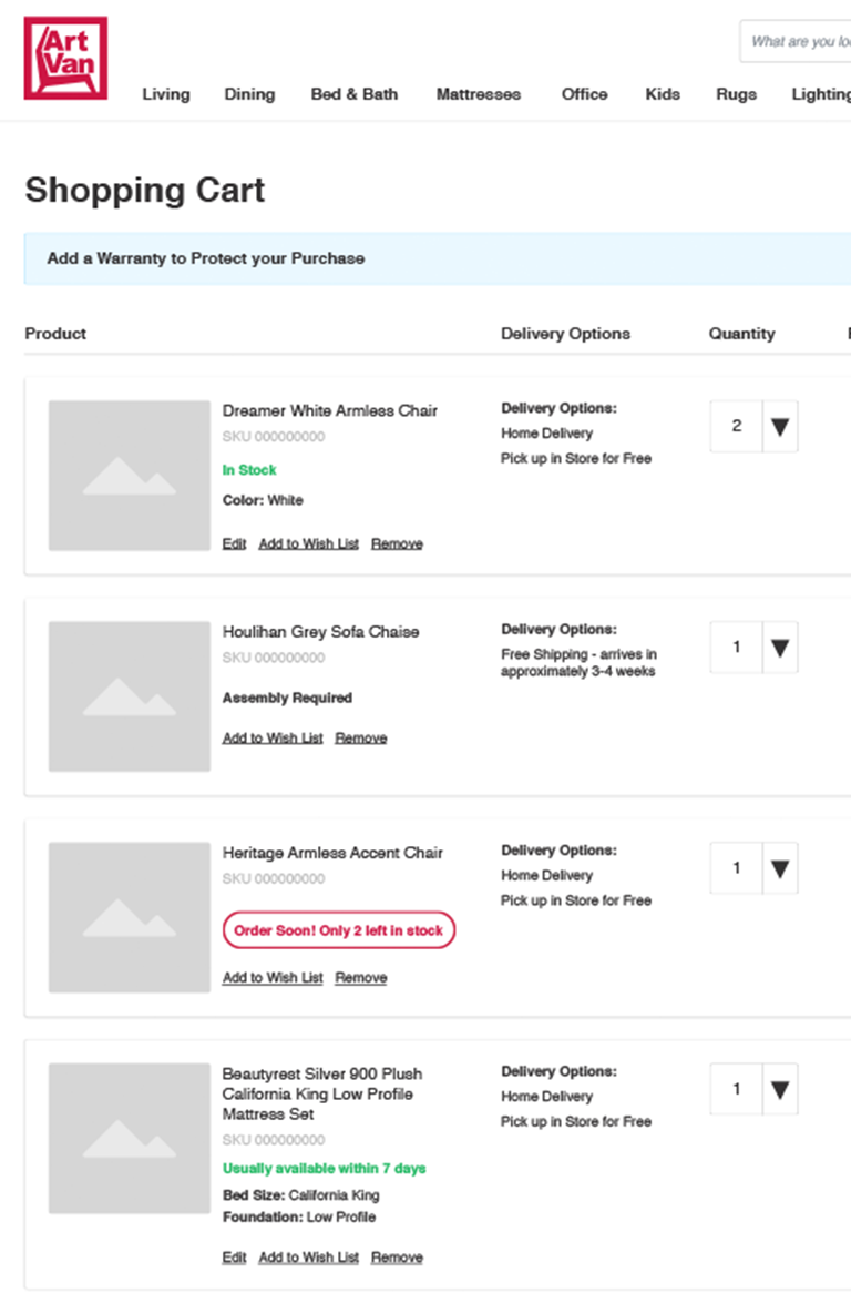
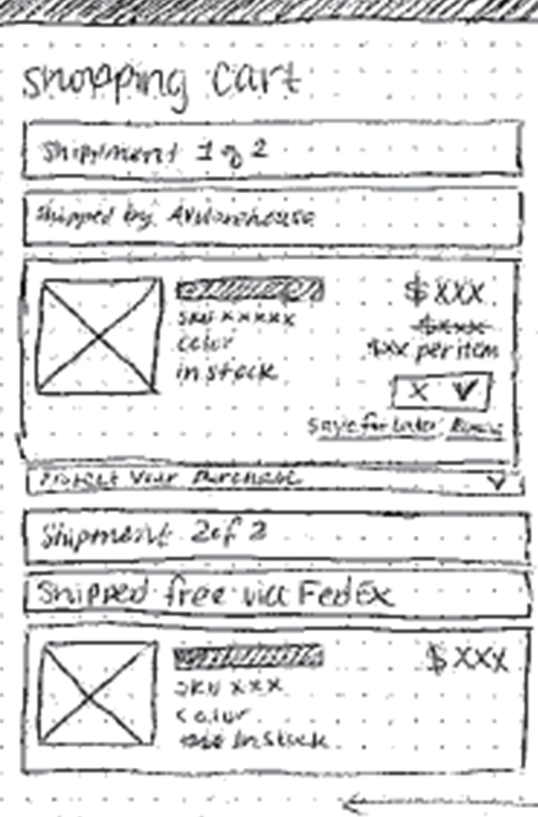
Solution: Allowing customers to make a choice in their delivery options at a cart level will clear up confusion on how to make this choice, resulting in less phone calls to the Help Desk. Showing ship groups at a cart level will also inform the customer of separate deliveries earlier in their checkout journey.
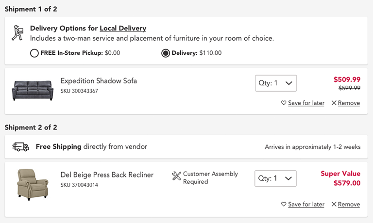
To further educate the customer, inclusion of clear descriptions for each type of delivery will help determine what kind of delivery they choose.
Issue #2: No Save For Later functionality within the Cart.
Based on HotJar heatmap data, Voice of the Customer reports, and anonymous feedback received from Qualtrics surveys, it became clear that customers were using their Carts as a space to compare products, and to come back later when they were ready to purchase.

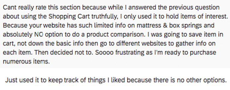
What the Product Detail Pages lacked was a method for customers to compare product. After discussing options with Salesforce business analysts, the level of effort to develop product compare functionality was significant enough that it made more sense to investigate use of Save For Later functionality within the cart instead.
Due to customer response, this seemed to be how customers were using the cart already — even without the current availability of Save For Later within the cart.
Solution: Investigate competitor use of Save For Later functionality within the checkout journey, and design for this experience on ArtVan.com. This will allow customers to quickly save product they’re not ready to purchase for later.
Issue #3: Cart Summary does not give a breakdown of price by line item.
There were some initial Quick Wins to the Cart Summary that were added to improve customer experience, the most specific centered around Warranty and how it was displayed to the customer.
Customers who added a Warranty to their purchase did not see this listed as a line item within the Cart Summary. Once applied, price of the Warranty was added to their Subtotal increasing the overall price number within the customers order. Understandably, this caused some confusion.
Quick Win Solution: add an asterisk underneath Subtotal, detailing that the subtotal number includes the addition of that Warranty selection. Due to bandwidth and LOE from Salesforce Developers, this was the quickest solution for the time.
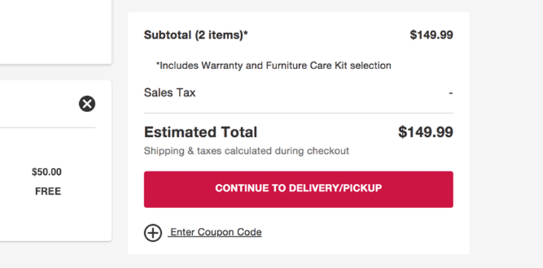
Even with this addition, it was not the correct solution. We had confirmation of this confusion from Voice of the Customer reports, and anonymous feedback recieved from Qualtrics surveys that customers still wanted to see fees as line items within their Cart Summary.
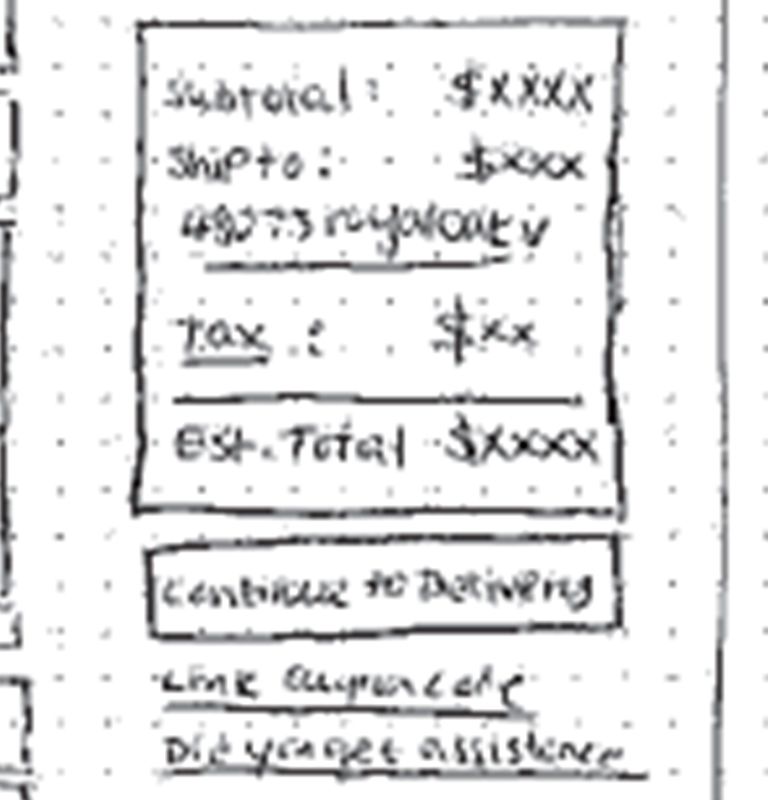
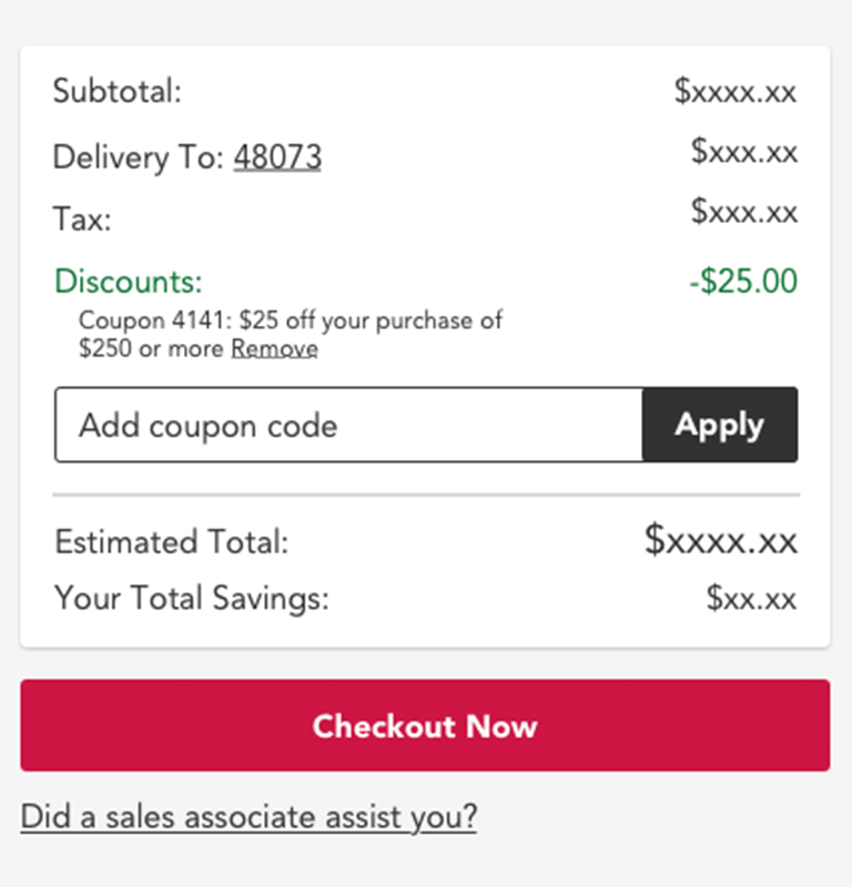
Solution: include line items for Warranty, Tax, Discounts via Coupon Codes or product discounts. Inclusion of total savings gives customer peace-of-mind that they’re getting a decent deal.
Issue #4: Product tiles are cluttered with information.
Much of the information being shown on a product within the cart is redundant and not necessary at this stage of the checkout journey. Cleaning up what we are showing the customer will help reduce confusion and improve the overall look and feel.
Redundant information includes:
- In Stock messaging and unclear In Stock messaging (Out of Stock remains)
- Color (if it is already listed within the product name)
- Repetitive delivery options across every product
- Promotional messaging
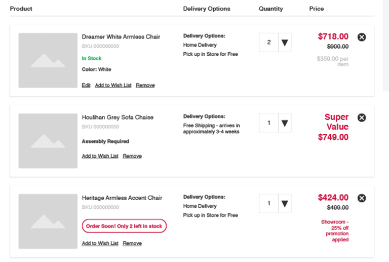
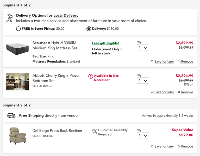
Cleaning up product tiles and utilizing shipment groups to separate the various deliveries makes it easier for the customer to interpret how they will be receiving their delivery and the messages across each product.
Expected Results
The improvements made to the Shopping Cart will reduce the amount of customer confusion and increase conversion rates.
Programs used: Sketch App